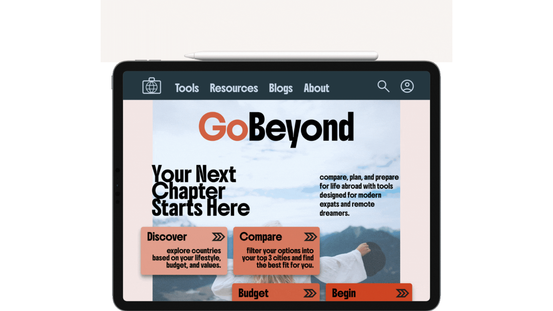
GoBeyond
Tools designed for modern expats and remote dreamers.
My Role
Scope
Deliverables
UX/UI Designer
UX Research
UX Design
UI Design
Prototyping
Component Library
High Fidelity Designs
Usability Testing
Tools
Figma
Excel
Canva
Pen & Paper
The What
The Why
The Why
The How
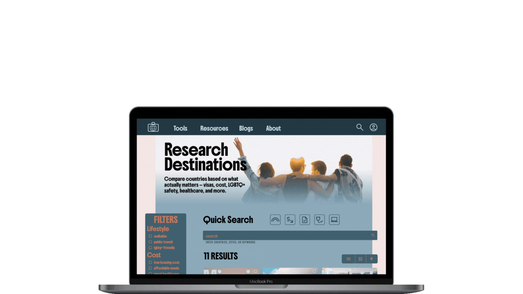
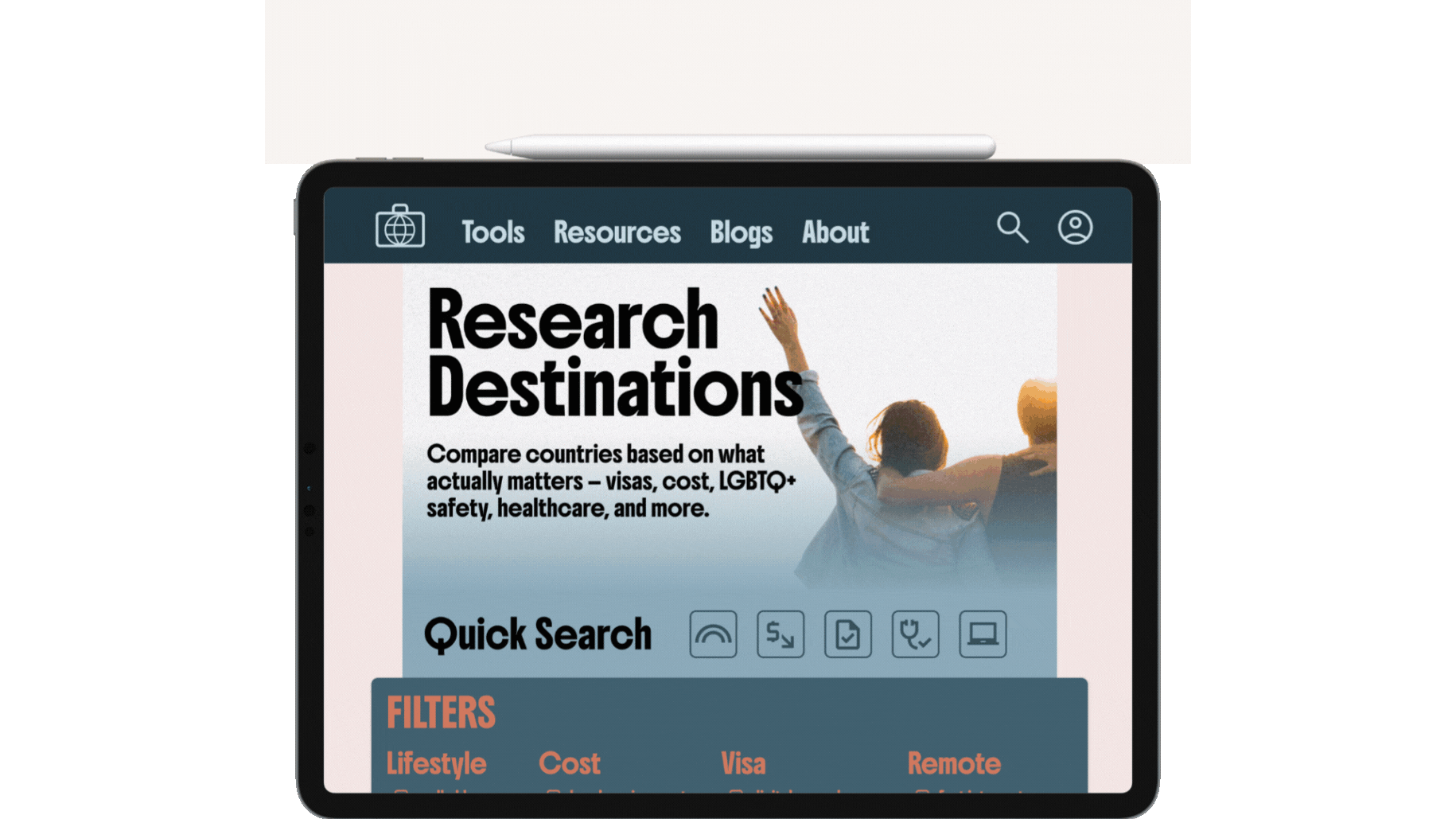
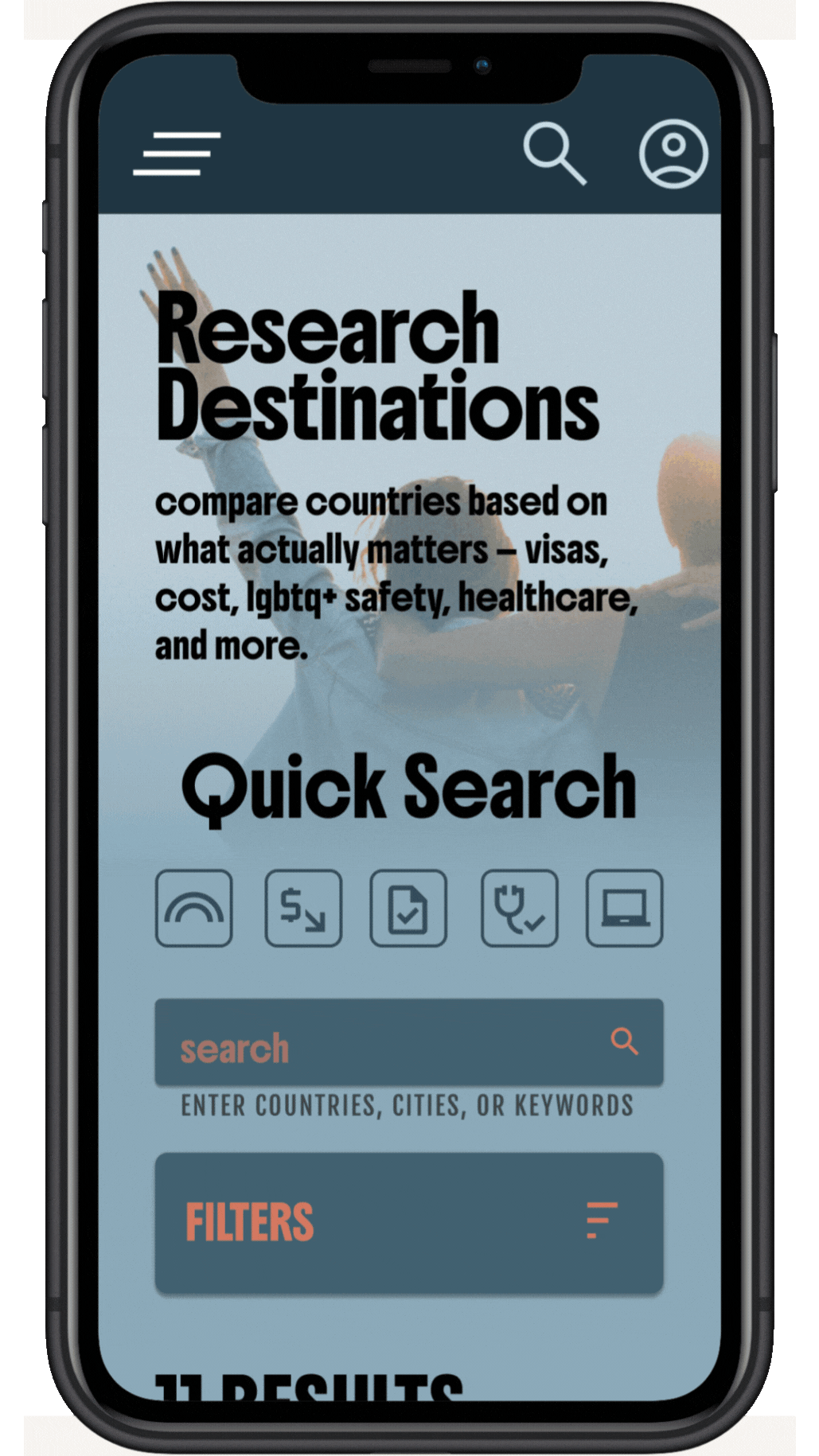
GoBeyond is a platform for future expats to research, compare, and plan their move abroad. It blends personal storytelling with practical tools—like city match-ups, visa breakdowns, and mental health check-ins—to make relocating more inclusive, informed, and empowering.
Moving abroad shouldn’t feel like starting from zero. For LGBTQ+ folks, BIPOC travelers, remote workers, and anyone seeking a better life abroad, the process can be overwhelming, unclear, or not made for people like us. GoBeyond exists to fill that gap—with data, design, and empathy.
Start by exploring country profiles tailored to your needs—cost, visa ease, LGBTQ+ rights, climate, and more. Use our comparison tools, browse real blogs, plan a scouting trip, or track your next steps with your personalized dashboard. Whether you're dreaming, researching, or booking a flight, GoBeyond meets you there.

Empathize
Understand user's needs and frustrations
Empathize
Conceptualize
I conducted multiple interviews with people of diverse backgrounds to fully understand my users needs, goals, and future potential pain points.
Drawing upon the insights gathered from my interviews, I created a detailed user persona and user stories. This process allowed me better comprehend the behaviors, needs, and motivations of the typical end user. By visualizing their experiences, I was able to identify key touchpoints and pain points, ultimately enhancing my of how to best serve them.
.png)
Define
Create a goal that best suits the user
Define
Based on the insights gathered from my interviews and user persona, I crafted a detailed user journey map to pinpoint common complaints and potential growth opportunities. This informed the development of a comprehensive site plan, rooted in the user persona, user story, and user journey map, which supports the initial design, goal statement, and ideation framework.


Goal
After further analysis of the above user data, personas, and journey maps, I came to a singular goal statement that remained the focal point for the ideation phase of the project...
Our website will empower future expats to make informed, confident relocation decisions, which will reduce confusion and increase inclusivity in the relocation process by offering personalized tools, real-life stories, and identity-aware data. We will measure effectiveness by user engagement, destination shortlists saved, blog contributions, and successful visa or relocation milestones shared by users.
Ideate
Translate user insights into feature ideas
Ideate
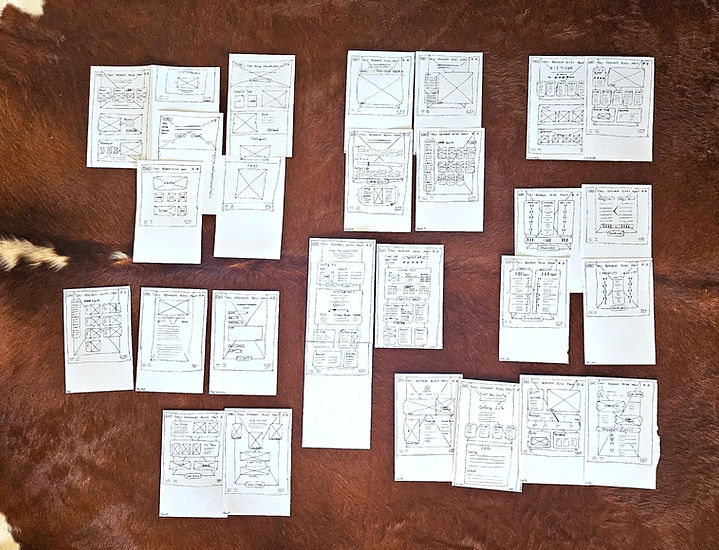
I began with crazy eights and analog wireframes, rapidly sketching and iterating multiple times on the initial design to bring each webpage concept to paper and address the user issues I had previously identified.
Prototype
Take ideas, test designs, and create the solution
Prototype
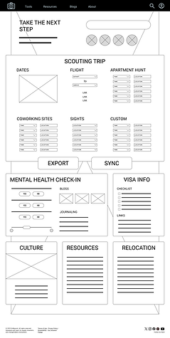
The cacophony of hand sketches gradually evolved into low-fidelity Figma wireframes, setting the stage for the initial prototypes. Lo-Fi prototypes were developed first, focusing on site usability and the degree of success when referencing the initial goal statement. Incorporating insights from user interviews came with testing these lo-fi prototypes.

Test
I conducted comprehensive usability tests with a group of original interviewees to identify any pain points they have encountered during their experience. By engaging with these participants, I aimed to gain deeper insights into how they interact with the site. This process not only highlighted the strengths of the user experience but also revealed critical challenges that need to be addressed for a smoother overall interaction.
Pain Point Implementation
Pain Point: Some users, particularly those who are tech-savvy, may struggle to navigate the site's extensive content.
Improvement:
-
Implement a horizontal sticky filter bar featuring icons.
-
Increase visual hierarchy.


Pain Point Implementation
Pain Point: Some pages present large blocks of info without consistent contrast, making them harder to scan.
Improvement:
-
Use more visual cards or tiles with headings + 2–3 line summaries before expanding content.
-
Introduce clear section dividers with icons and color or border contrast.
-
Emphasize “next action” buttons with color priority and space.

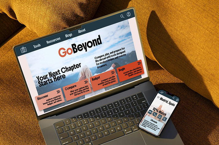
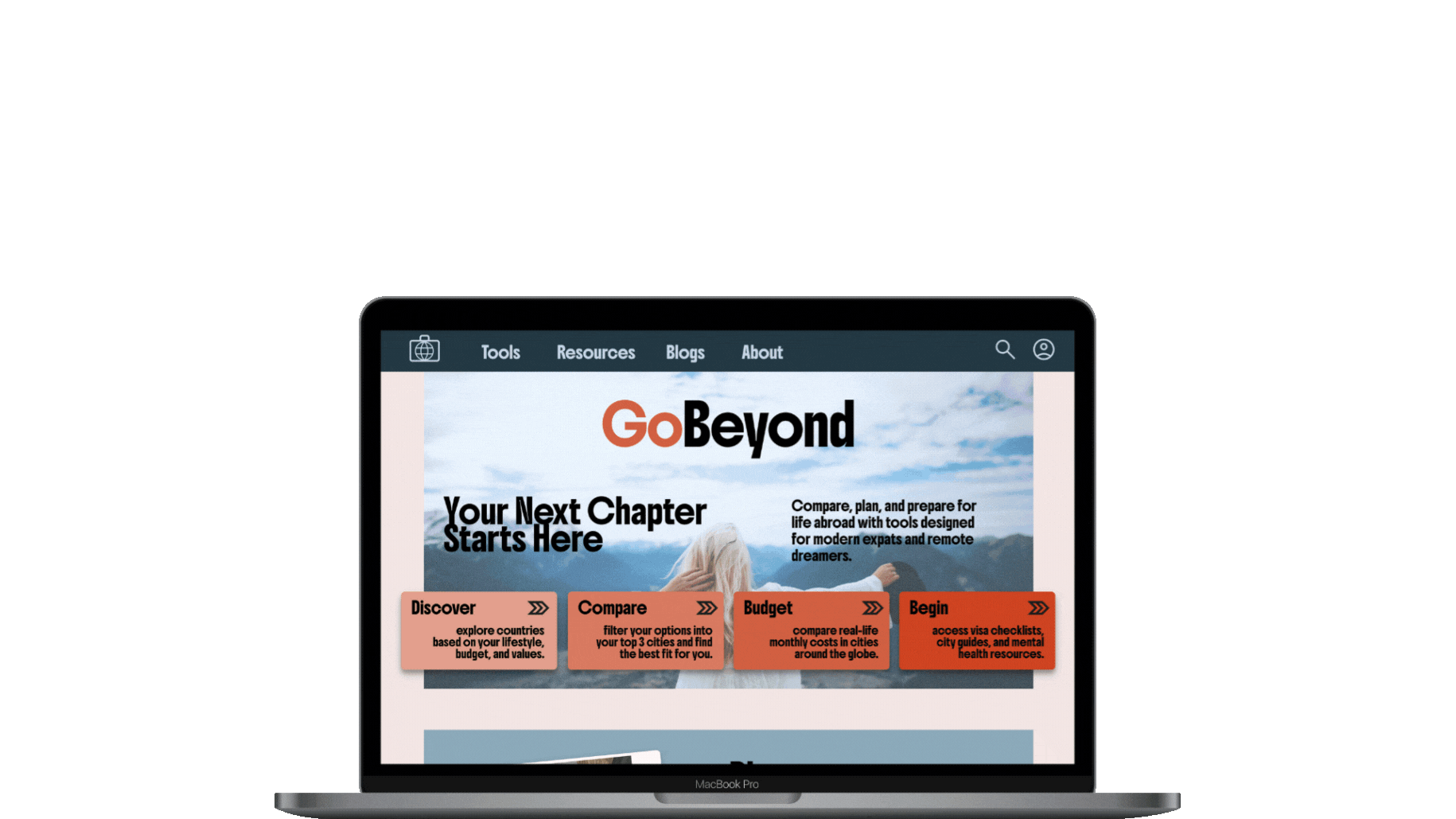
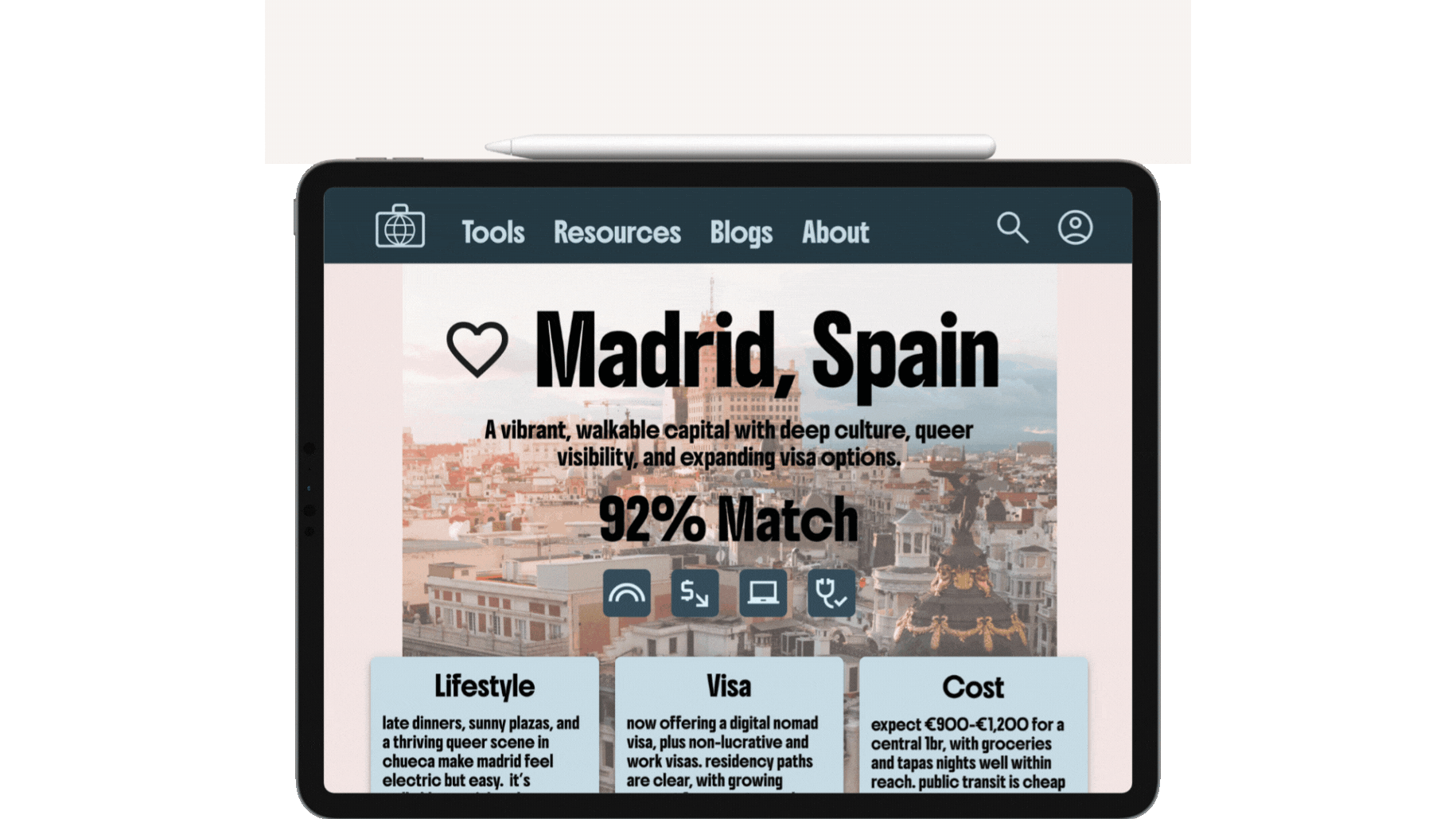
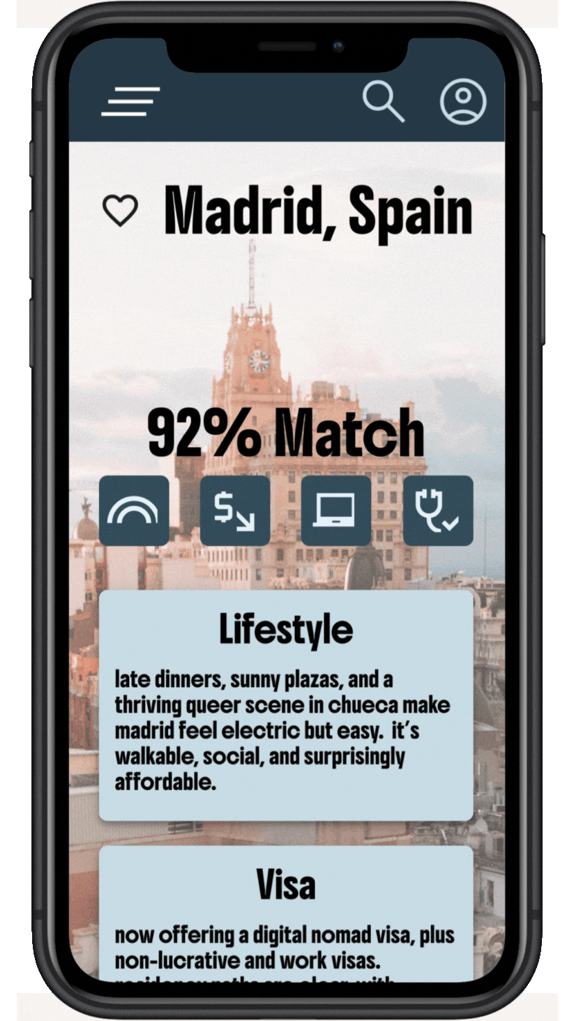
Responsive Website
Hi-Fi Design
The key design consideration for this project centered around having a responsive design. Users expressed the need to do in depth research on their computers, compare cost of living calculations on their tablets at a coffee shop, and browse countries casually on the go. All these considerations were taken into account to create a fully responsive site, shown below.
The insights gained from this second round of interviews and feedback paved the way for my mockups and high-fidelity prototypes. With a clear understanding of the users' needs and preferences, I was able to develop a comprehensive UI design for the site. This design encompasses not only a unique visual style but also a cohesive design system that is uniquely tailored to reflect the brand. The result is a polished and engaging user interface that effectively communicates the brand's essence while enhancing the overall user experience.


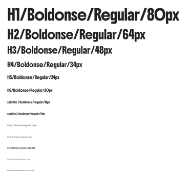
Visual Style
I created a distinct design system that mirrors the excitement of moving abroad

Hi-Fi Design


Reflect
Introspect and develop skills to help further users
Lessons Learned
Next Steps
Through designing GoBeyond, I learned how deeply personal and complex relocation can be—especially for marginalized groups. User interviews reminded me that moving abroad isn’t just about logistics; it’s about identity, safety, and belonging. I also realized how critical it is to balance data-driven tools with emotional support—people want more than numbers; they want to feel seen. Lastly, designing with intersectionality in mind challenged me to question default assumptions and prioritize accessibility, nuance, and inclusivity throughout the UX.
Moving forward, I plan to:
-
Conduct usability testing with a wider range of users, especially queer, BIPOC, and disabled expats.
-
Refine and expand the city comparison tool to offer more tailored results and lifestyle presets.
-
Build out the community/blog features to invite more real voices and lived experiences.
-
Explore partnerships with visa advisors, mental health professionals, and relocation services for resource integration.
-
Develop a scalable design system to support future features like group planning, budgeting tools, and mobile responsiveness.