Seed Money
Plant seeds for the future,
with your people.

My Role
Scope
Deliverables
UX Researcher
UX/UI Designer
UX Research
UX/UI Design
Prototyping
Design System
Mid Fidelity Designs
Usability Testing
Tools
Figma
Miro
Sheets
Canva
Pen & Paper
The What
The Why
The Why
The How
Seed Money is a mobile app designed to help friend and family groups track shared expenses, build household budgets, and contribute toward collective savings goals. It brings transparency and simplicity to group money management through intuitive design, smart reminders, motivational progress tracking, and AI tips for growth.
Managing shared finances is often stressful, confusing, and emotionally charged—especially for roommates, partners, or families. Users need a tool that reduces conflict, increases accountability, and makes saving feel rewarding, not awkward or tedious.
Through user interviews, persona development, and lo-fi prototyping in Figma, the project identified key behaviors and frustrations around shared money. The app’s design focused on quick expense logging, visual goal tracking, and passive AI-generated tips to support real-world group dynamics and financial habits.
Empathize
Understand user's needs and frustrations
Empathize
I held several interviews with individuals from various backgrounds to gain a comprehensive understanding of my users' needs, goals, and possible future challenges.
Conceptualize
Based on the insights from my interviews, I developed three comprehensive user personas and stories. This process helped me gain a deeper understanding of the behaviors, needs, and motivations of the average end user. By visualizing their experiences, I was able to pinpoint essential touchpoints and pain points, ultimately improving an approach to serve them effectively.


Define
Create a goal that best suits the user
Define
Drawing from the insights gained through my interviews and user personas, I created a thorough user journey map to identify recurring complaints and possible growth opportunities. This guided the creation of a user journey map, which underpins the initial design, goal statement, and ideation framework.
.png)
.png)
Goal
After a deeper examination of the user data, personas, and journey maps mentioned above, I formulated a concise goal statement that served as the main focus during the project's ideation phase.
Our app will let users track shared expenses, contribute to group savings goals, and automate reminders which will affect roommates, families, and multi-generational households by reducing financial misunderstandings, improving accountability, and increasing motivation to save together. We will measure effectiveness by tracking user engagement with shared goals, reduction in missed or late contributions, and user satisfaction through regular in-app surveys and retention analytics.
Ideate
Translate user insights into feature ideas
Ideate
I began with crazy eights and analog wireframes, rapidly sketching and iterating multiple times on the initial design to bring address the user issues I had previously identified.

Prototype
Take ideas, test designs, and create the solution
Prototype
The noise of hand sketches slowly transformed into lo-fi Figma wireframes, paving the way for the first usability tests. Initially, lo-fi prototypes emphasized site usability and how well they aligned with the initial goal statement.

Test
I conducted in-depth usability tests with a group of original interview participants to uncover any pain points they experienced while interacting with the site. This hands-on approach provided valuable insight into real user behavior, revealing both the strengths of the current user experience and key areas where improvements are needed to ensure a more seamless and intuitive journey.
Pain Point & Implementation
Pain Point: Users are confused or unsure about who has paid what, and want a shared understanding without confrontation.
Improvement:
-
Group Dashboard Card
-
Activity Feed with Filters
-
Shared Goal Progress Bar


Pain Point & Implementation
Pain Point: Users found the process of logging expenses too long or complicated, especially in social or high-stress situations.
Improvement:
-
Floating "Quick Add" Button that opens a fast modal with 3 inputs: amount, category, and who paid.
-
Smart Defaults
-
Predict category based on previous entries.
-
Larger, Tappable Buttons
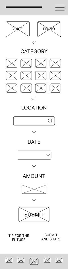

Mid-Fi Design
After gathering feedback from the second round of interviews, I moved into the design phase with a better grasp of what users needed. I created mid-fi mockups to explore layout and functionality. The final design includes a consistent visual style and a simple design system that aligns with the brand. Overall, the updated interface is more intuitive and accessible and better supports the user experience.
Visual Style
II created a distinct design system that mirrors the excitement of moving abroad


Mock-Ups


Reflect
Introspect and develop skills to help further users
Lessons Learned
Next Steps
This project highlighted the value of continuous user feedback throughout the design process. Interviewing participants at multiple stages helped validate assumptions, uncover real-world frustrations, and guide meaningful design decisions. I also learned how important it is to balance visual design with simplicity and clarity—especially when creating tools meant for shared use. Taking the time to prototype early and test often made the design more grounded, usable, and aligned with real user needs.
Moving forward, I plan to:
-
Refine the mid-fidelity mockups based on user testing feedback
-
Add edge case screens and error state designs
-
Explore motion and micro-interactions to enhance usability
-
Conduct another round of usability testing with updated designs
-
Prepare a prototype for developer handoff